Image credit: Unsplash · Localized source image converted to WebP
7 signs your website is losing clients
The 7 signs proving your website is losing clients without you knowing
A qualified prospect who abruptly leaves your platform because an image takes three seconds too long to load will absolutely never bother sending you a message to complain. The final abandonment always happens in absolute silence, discreetly hidden behind thick traffic statistics that you materially don’t have time to analyze. Here is exactly how to spot on the ground these completely silent structural flaws before your local competitors capture all your precious business opportunities.
The unstable foundation: Technical slowness and overwhelming mobile incompatibility
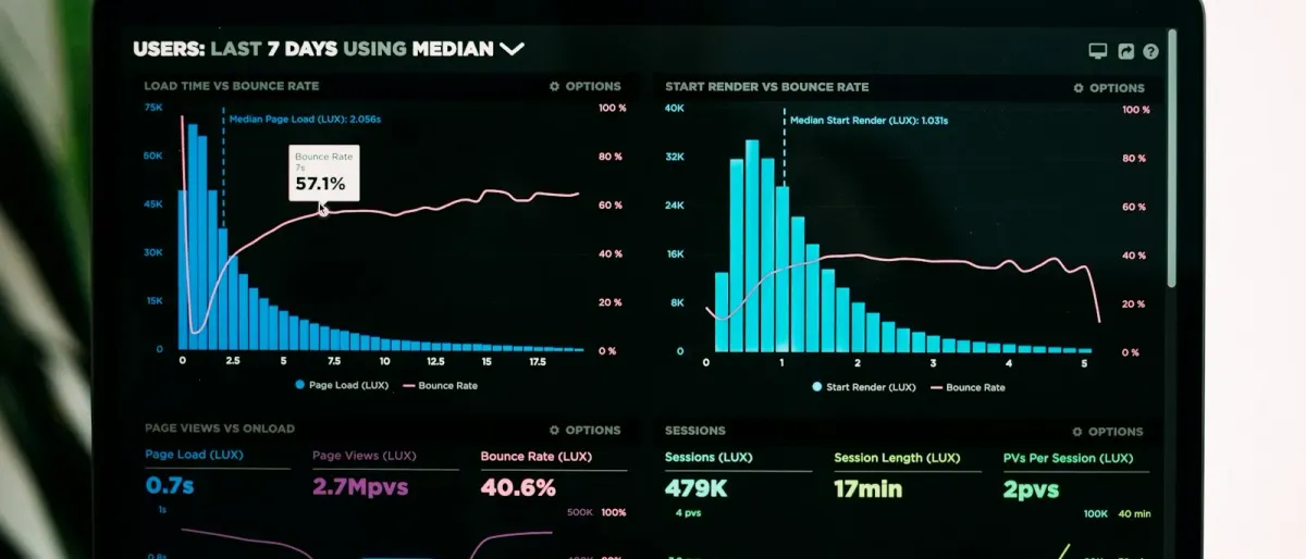
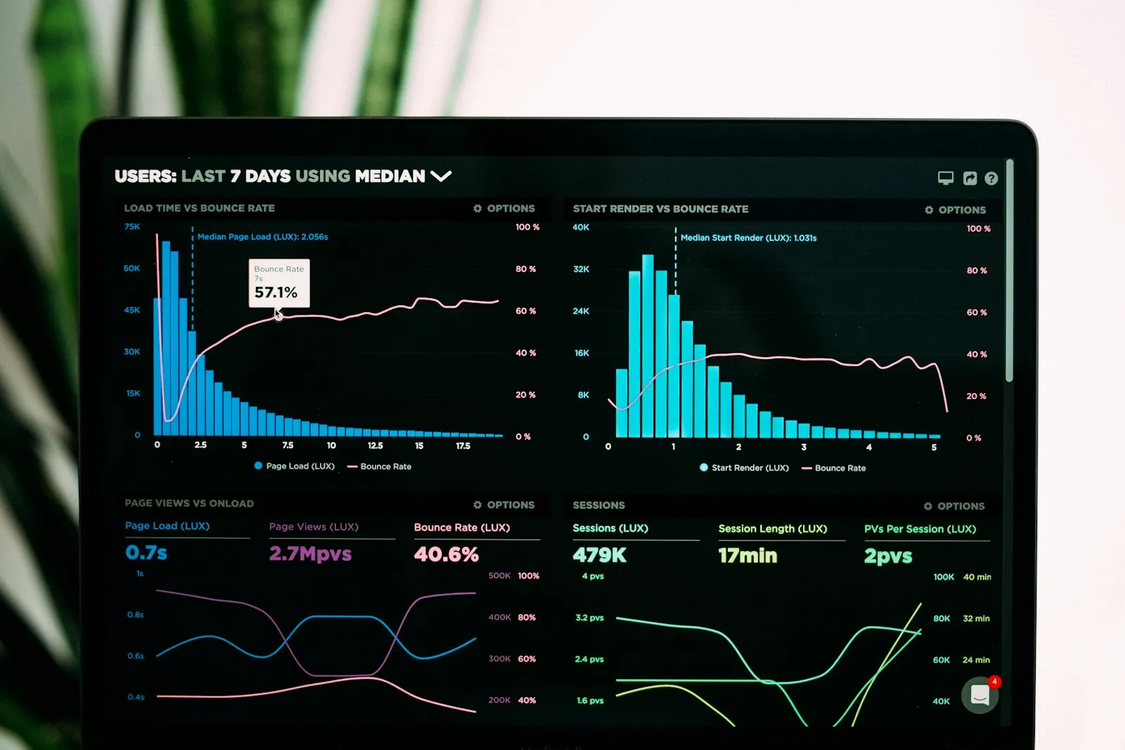
Every second of timed delay between your prospect’s initial click and the full display of your homepage clinically destroys half of your logical chances of seeing them finalize a conversion step.
The first obvious signal of a failing digital presence is literally measured with a stopwatch. As an independent digital director based in Tarragona, but actively exchanging with many decision-makers in French-speaking Belgium, I continuously carry out velocity audits. The verdict is often final. When an SME manager tells me that their website is losing clients, the number one technical culprit systematically resides in a six-megabyte homepage, weighed down by promotional drone videos that monopolize the global bandwidth.
Passionate about computer science and logical mechanics since the age of 12, the optimization of data flows has perpetually constituted a real technical obsession for me, far from simple aesthetic concepts. Take this textbook case very frequent in my audit work: a visitor navigating with their mobile phone on a regional train between Brussels and Namur almost systematically benefits from an unstable internet connection. If they absolutely have to wait five full seconds facing a white screen for your third-party behavioral analysis scripts like Facebook Pixel to heavily finish initializing, they will simply press their browser’s dreaded back button, making you definitively lose this contact. This bounce is the first of the major invisible signals: immediate display slowness.
The second invisible signal strikes just as hard: mobile ergonomics not designed for human thumb use. A navigation architecture lovingly designed by your web agency on a 27-inch iMac in a bright office crashes miserably against the harsh reality of the wet outdoor terrain. If your platform’s call-to-action buttons are arranged way too close to each other on a small Android smartphone screen, making the attempt to tap the reception phone number extremely frustrating, the friction felt instantly provokes anger in the rushed user, pushing them towards a clearer local competitor site.
Immediate loss of trust: A DIY identity and invisible proofs
Your company’s fundamental credibility is virtually earned in less than a quarter of a second through the meticulous coherence of your graphic design, and is pulverized just as quickly if you display an amateur style.

The third indisputable signal causing you the silent evaporation of qualified contacts directly concerns the total fragmentation of your corporate brand image. As soon as a client perceives even a slight brutal typographic inconsistency — for example, a section title in Comic Sans MS on your contact page in total contradiction with the very luxurious visual approach of your services proposal —, the silent signal of professional negligence they receive acts as an absolute repellant. The user equates the attention to detail of your digital presence with the execution quality of the services you will bill later.
In addition to being a digital director, I am deeply rooted in the visual world, having been a professional photographer for several years, which inevitably sharpens my eye for overall harmony. The radical lack of uniformity across a device causes an immediate wear of prior trust.
The fourth devastating signal proving a website is losing clients is the total absence of geographically verifiable and factually anchored social proofs. Peremptorily claiming to be the absolute leader in the Belgian or European market without transparently offering solid testimonials and surgical descriptions of completed projects condemns an industrial site to generate doubt in whoever actively browses it. Seasoned visitors today demand to read demonstrable authenticity.
For example, when I intervene with expats proudly residing in Catalonia to offer high-quality qualified portraits, they never blindly commission me just for the specifications of my expensive photographic lenses or my website’s general aesthetics. They always book my photographic services after consulting my case studies which specifically include real terrain challenges solved in real situations, systematically supported. If your B2B platform never mentions the precise city, the nature of the intervention, and the identity of your client in Liège to demonstrate the real success of your previous technical operations, you are navigating an ocean of hollow promises.
Massive friction points: The form inquisition and the chaotic tunnel
Authoritatively demanding a vague, curious prospect to reveal their entire business online to access a simple preliminary rate is akin to building the wall yourself that will prevent them from moving towards you.
The fifth major signal of a failing digital presence undeniable resides at the central level of information capture: the so-called abusive interrogation form on the contact page. In 2018, I used the PyTorch development framework and actively explored complex machine learning techniques, long before the massive advent of popular modern mass-market tools like the automatic software Aftershoot or Imagen AI, in order to automatically perform precise and technical qualitative scoring on several thousand heavy photographs simultaneously. This very intense work on manipulating brutal data of paramount importance firmly encoded a professional certainty in me: optimization must be done by reduction, but it is useless and dangerous to blindly hoard or demand massive databases of information without immediately applying contextual utility and respectful usage to them.
The vast majority of very small and medium-sized businesses still add dozens and dozens of strictly mandatory text fields on their online input interfaces: street name, an external document number, or legal status, solely for the simple purpose of swelling the level of the contact base they will probably never open in their lifetime. For a busy senior executive on the road to Namur, this wall of demands is unacceptable. It is one of these fatal invisible signals: the more you dramatically complicate your suspect’s initial digital interaction, the more mechanically massive and immediate their spontaneous abandonment will be.
This tortuous path leads me to the sixth worrying signal: the endless labyrinth of an incoherent and poorly architectured navigation menu. I consider it fundamental to guide the visitor in an extremely simple and deliberate manner, without asking them for superfluous cerebral effort to successfully understand.
flowchart TD
    A[Mobile Google Search] --> B{Loading time < 3s ?}
    B -- No --> C[Leak 1: Immediate return to Google results]
    B -- Yes --> D[Homepage message display]
    D --> E{Clear value proposition strictly from the start ?}
    E -- No --> F[Leak 2: Navigation stopped and closed without regret]
    E -- Yes --> G[Prolonged visit to the target contact page]
    G --> H{Form containing strictly less than 4 mandatory fields ?}
    H -- No --> I[Leak 3: Input abandonment before the final button]
    H -- Yes --> J[Successful transaction: the first direct contact is generated]
Invisible prospect path — 3 leakage points before the first contact
A disastrous architecture where sections overlap or look alike (“Our achievements”, “Our portfolio”, “Our case studies” all pointing to the exact same type of content) prevents the visitor from instantly understanding your process. This broken path causes the loss every month of major clients fully capable of paying for your precise expertise in Belgium and forces you to restart your costly cold prospecting in physical reality.
The permanent passive strategy: The missing or invisible call to action
Letting a visitor passionately read the meticulous descriptive description of your entire specialized expertise without gently imposing the specific path to immediately move to the transactional step openly constitutes consensual sabotage of your own commercial investments.

The seventh and very last of our famous invisible signals of discreet digital defeat is undeniably the total absence, or rather the presence of a hideous and ineffective ghost terminal button, on every page bottom, called the Call-to-Action. My field experience directly accompanying SMEs has proven once again that the most tenacious salespeople in Belgium suffer very bizarrely from extreme shyness when it comes to clearly formulating the most obvious request on their digital space: “Sign with us to move forward now!”.
Painfully displaying a simple and very laconic “Contact us here” no longer constitutes a convincing stimulating directive. On the contrary, it stems from a completely passive strategy typical of the early web era. The disastrous result is always that your web platform systematically fails faced with this assumed lack of strong leadership. If the button loses its visual power in the textual flow because it displays the same global monochrome color palette, it greatly contributes to convincing the uncertain and distracted internet user to simply leave the zone. Your visitor is looking for their intense difficulty to be concretely taken charge of.
✓ My rigorous digital protocol for generating calls to action that truly convert in the field
- Offer at most one strictly obvious main conversion option per page, never two options that will inevitably dilute active attention.
- Ban the classic empty expression 'Learn more' for a powerful action verb, such as 'Build your project right now'.
- Guarantee with absolute certainty and requirement a sharp and vivid color contrast level for this essential terminal button to clearly stand out from your entire graphic dressing.
- Transparently provide a short reassuring sentence or contextual text pasted exactly right under the active button, typically specifying 'Thirty-minute free meeting' or 'Guaranteed confidential quote within twenty-four hours'.
The overriding urgency to plug your leaks and stop this waste
The rapid and targeted revision of your current platform’s failing technical structure and confusing messages will overall cost you infinitely less than the frantic pursuit of relentless cold phone prospecting.
Each problem listed during this field demonstration plays a modest distinct but very relentless role. By actively consolidating the initial infrastructure and systematically eradicating the massive ergonomic heaviness observed that causes the surreptitious appearance of each dreadful “leakage point” in your home, the percentages of unknown visitors mutating into solid proven clients will start displaying vigorous results again. These kinds of rapid evolutions will thus durably preserve you from structural risks and latent bankruptcies that worsen daily under indifferent statistics. The surgical correction of your technological environment requires no explosion of current standards or massive initial restructuring. It demands a simple firm positioning strictly based on true measurable data of success, the ones that the market demands from you down to the minute.
Frequently Asked Questions
How do I concretely identify with tangible figures that my website is losing clients every week?
Attentively and urgently look at your exact bounce rate observed on the consultation of the flagship mobile services section in Google Analytics. If this indicator exceeds the severely dangerous figure of 70 percent without any offer download or request submission recorded, you are mathematically losing serious guaranteed revenue every single day.
Are the invisible signals of user experience breakdown strictly identical for a B2B and B2C strategy in Belgium?
Fundamentally, the exact same deep psychological mechanisms undisputedly work identically, with one exception confirmed by usage regarding professionals: the visitor evolving in a B2B structure withstands the technical slowness felt when looking for accounting data extremely less quickly, but will curiously read a little more textual structural details once full speed is perfectly guaranteed.
Is it absolutely imperative to invest massively in a total redesign of my web infrastructure to quickly correct a failing digital presence detected during an audit?
No, absolutely not. In eight verified cases of losses out of ten in Belgium, completely surgical adjustments on one or two vital buttons, the meticulous cleaning of highly harmful initial obese image weights, and the definitive and ruthless deletion of about twenty purely decorative fields in a questionnaire perfectly suffice radically enough to restore the efficient pace of yesteryear.
What specific performance indicator should I urgently start looking at on my Google Analytics or Plausible Analytics tool?
The absolute fundamental report to scrutinize weekly with regularity is your specifically clear percentage of drop-off strictly located exactly in the middle of the form and specifically on mobile. This precise action indicator precisely flags the very cruel technical spot of the infrastructure where any serious capital leak actually begins.
Do the overall design and aesthetic quality of a web platform truly have a direct mathematical impact on the definitive loss of highly qualified clients?
Without a possible doubt. The mathematical level of perceived trust is drastically proportional and intimately welded exactly to the level of manic care felt brought directly onto the visited interface by your prospects. I relentlessly observe that the appearance of very precise contours and reassuring colors beautifully keep the user awake for a long time.
Make the immediate effort to drastically cast these toxic signals widely aside and definitively regain complete masterful control of these massive direct acquisitions. Join a profitable and highly performing model by addressing this thorny subject in detail very soon on amory-studio.com/en/simulateur.
Visual credits: source images localized from Unsplash and converted to WebP for local use.